Overview
Led a targeted, evidence-driven redesign of the Ami Colé website as the sole designer, partnering with founder, marketing, and engineering collaborators to align evolving business priorities with improved conversion pathways.
Rather than pursuing a full visual overhaul, the redesign focused on high-impact experience changes validated through audit findings, preserving effective components while intentionally optimizing areas creating measurable friction.
Approach:
Synthesized external and internal audit insights into a phased roadmap identifying where change would meaningfully improve user outcomes and business performance
PDP Redesign
Redesigned the product evaluation experience through a phased optimization strategy enabling reduced implementation risk and clearer attribution of conversion impact.
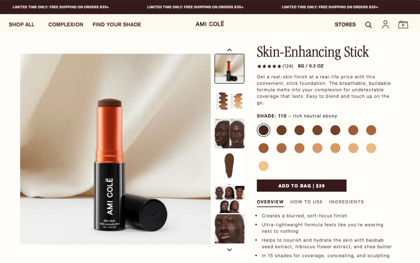
Phase 1: Above-the-Fold Optimization
Focused on enabling informed purchase decisions within the initial viewport.
Layout architecture
Responsive split-screen layout with media gallery (left) and decision-critical content stack (right)
Consolidated key evaluation signals above the fold:
Product overview and value summary
Ingredient highlights
Overall rating and social proof
Primary CTA
Business problem: High drop off before purchase due to excessive journey to basic information and poor CTA location (below the fold)
Design solution: Reduce time-to-confidence by surfacing essential decision inputs without requiring scroll behavior.
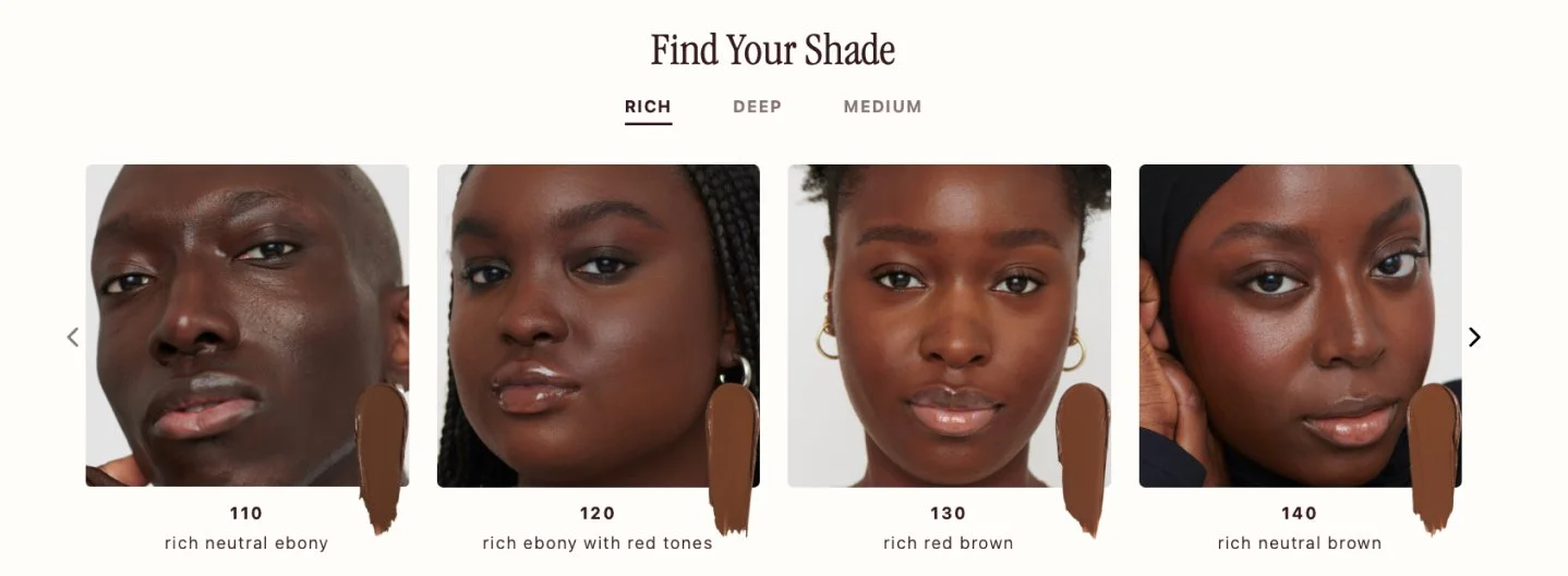
Phase 2: Confidence-Building Modules
Introduced structured modules below the fold to reduce uncertainty and support informed selection.
Shade Finder
Sectioned shade finder module positioned directly below the fold
Skin products displayed one-to-one on models for tone matching
Color cosmetics (lip & cheek) shown across all shades on multiple models for comparative evaluation
Business Problem: Sephora locations have limited shades available for in-store testing; costly returns/exchanges from online consumers
Design intent: Increase perceived personalization and reduce shade-selection risk
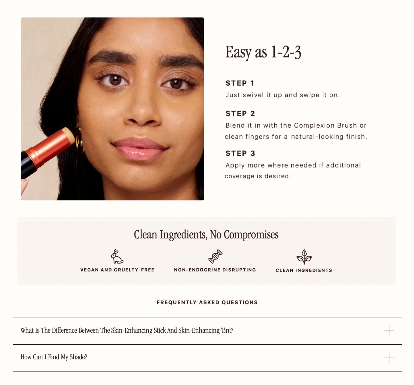
How-To Application Module
Instructional content featuring model wearing the product while visibly holding the product in-hand
Visual format informed by cross-channel performance insights indicating stronger conversion when product and outcome are shown simultaneously
Content direction influenced future art direction on shoots to ensure consistent asset capture
Design intent: Bridge the gap between aspiration and application by making product usage explicit and tangible.
Clean Ingredients & Standards Module
Dedicated section implemented based upon updated business priorities
Custom iconography system supporting claims:
Vegan and cruelty-free
Non-endocrine disrupting
Clean ingredient standards
Design intent: Reinforce trust and align product evaluation with evolving brand positioning.
Product-Specific FAQ Module
Structured question set tailored to each product
Experience and content framework defined in design and executed in collaboration with copy team
Design intent: Address common objections proactively and reduce decision friction.