Overview
Kurlfriend is a mobile platform that empowers users with kinky and curly textured hair make confident care decisions through ingredient analysis, routine tracking, and personalized discovery.
This project reframes hair care from scattered research content consumption to efficient, intentional decision support. Enabled to track routines, analyze product ingredients, discover DIY treatments, and make informed care decisions based on their specific texture and goals, users are provided with an accessible every day tool born out of a wealth of cultural knowledge.
Role:
Concept, Research, UX architecture, Interface Design, Testing/Validation
Problem
Core Issues
Individuals with textured hair must conduct extensive independent research and often expensive trial & error to determine:
Which products are compatible with their texture
Whether ingredients are safe, harmful, and or may stagnate hair goals
Which routines support long-term hair health
How to execute or maintain specific styles
Without a centralized resource, decisions are slow, uncertain, and often costly.
Users are not just buying products — they are managing a continuous learning process.
Key Behavioral Patterns
Users consistently reported needing to research before purchasing or trying anything new. Many rely on multiple platforms simultaneously to validate decisions.
Hair care decisions are strongly tied to trust, ingredient transparency, and evidence that a product works for a similar hair type.
Participants emphasized wanting control over their hair routines without constant reliance on stylists or expensive experimentation.
Research
Research included interviews, secondary research on kinky & curly hair care practices and historical limitations, and usability testing of early prototypes.
Insight
Textured hair care is not just a maintenance routine — it is an ongoing knowledge practice shaped by community, identity, and lived experience.
Kurlfriend as a consumer learning system

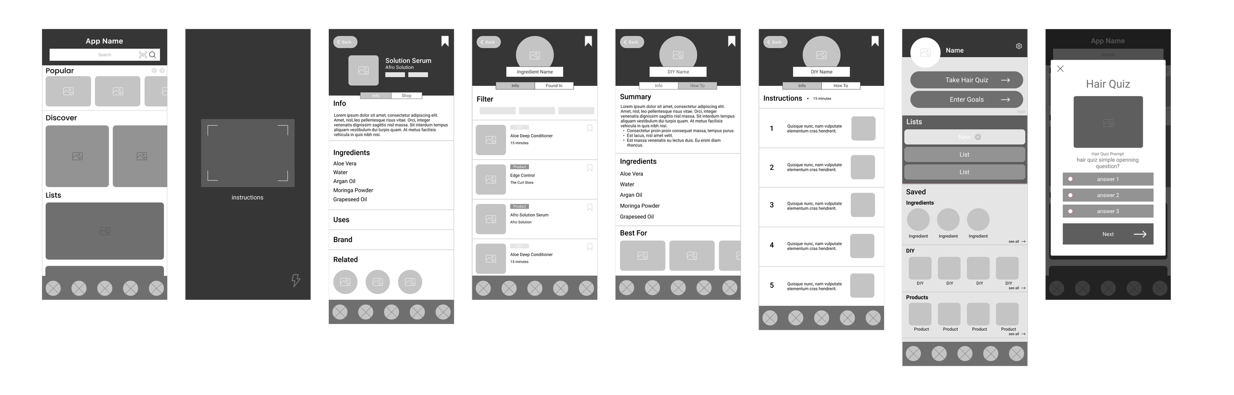
Early Mockups
These low-fidelity wireframes were used to map the product as a learning system rather than a collection of features. The focus was on exploring and narrowing down potential entry points (scan, ingredient profile, quizzes), defining how knowledge moves between surfaces, and reducing decision friction before introducing visual design.
Discovery
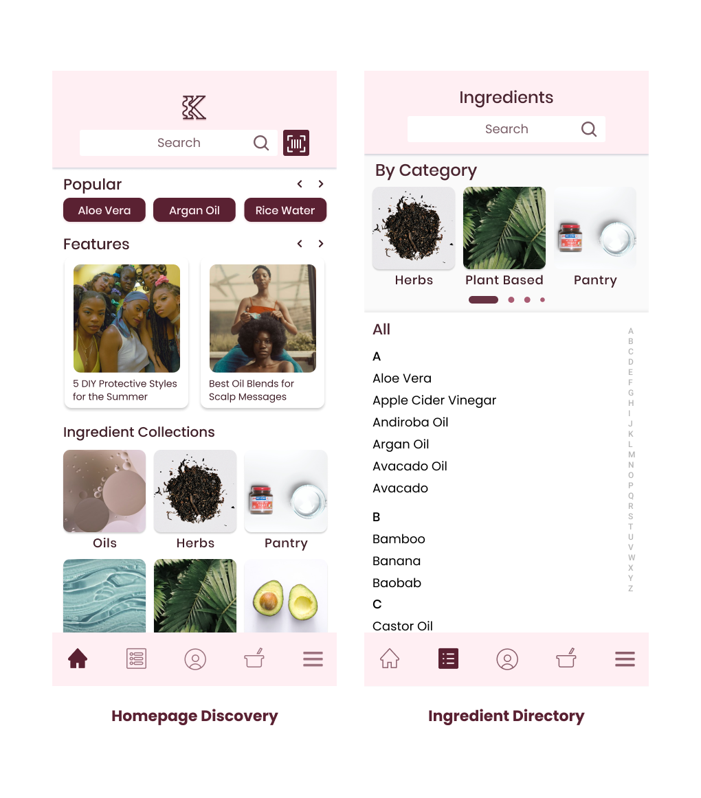
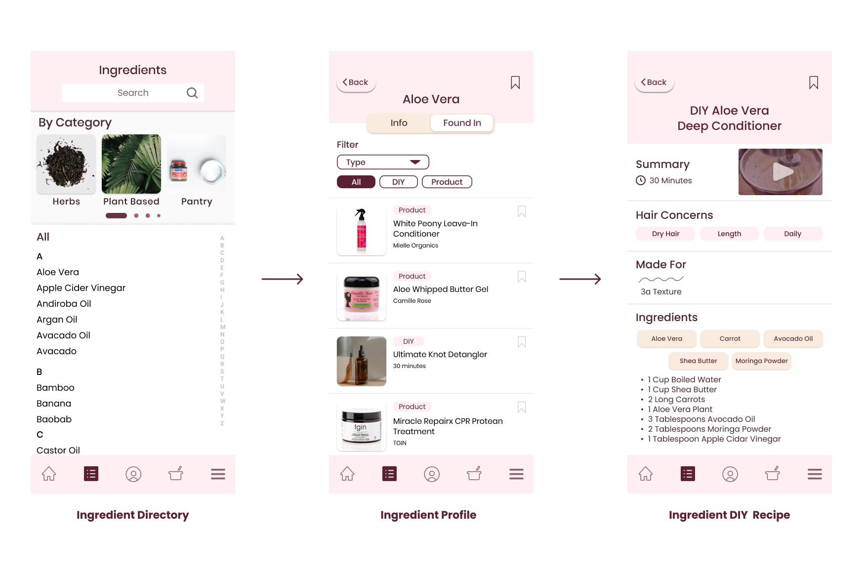
Ingredient Intelligence
Primary entry point for education-driven users
Structured ingredient database (pantry, herbal, oils, water-soluble, etc)
Ingredient → benefits → compatibility → related DIY recipes
Supports understanding before purchase
Design intent: transform raw information into actionable interpretation
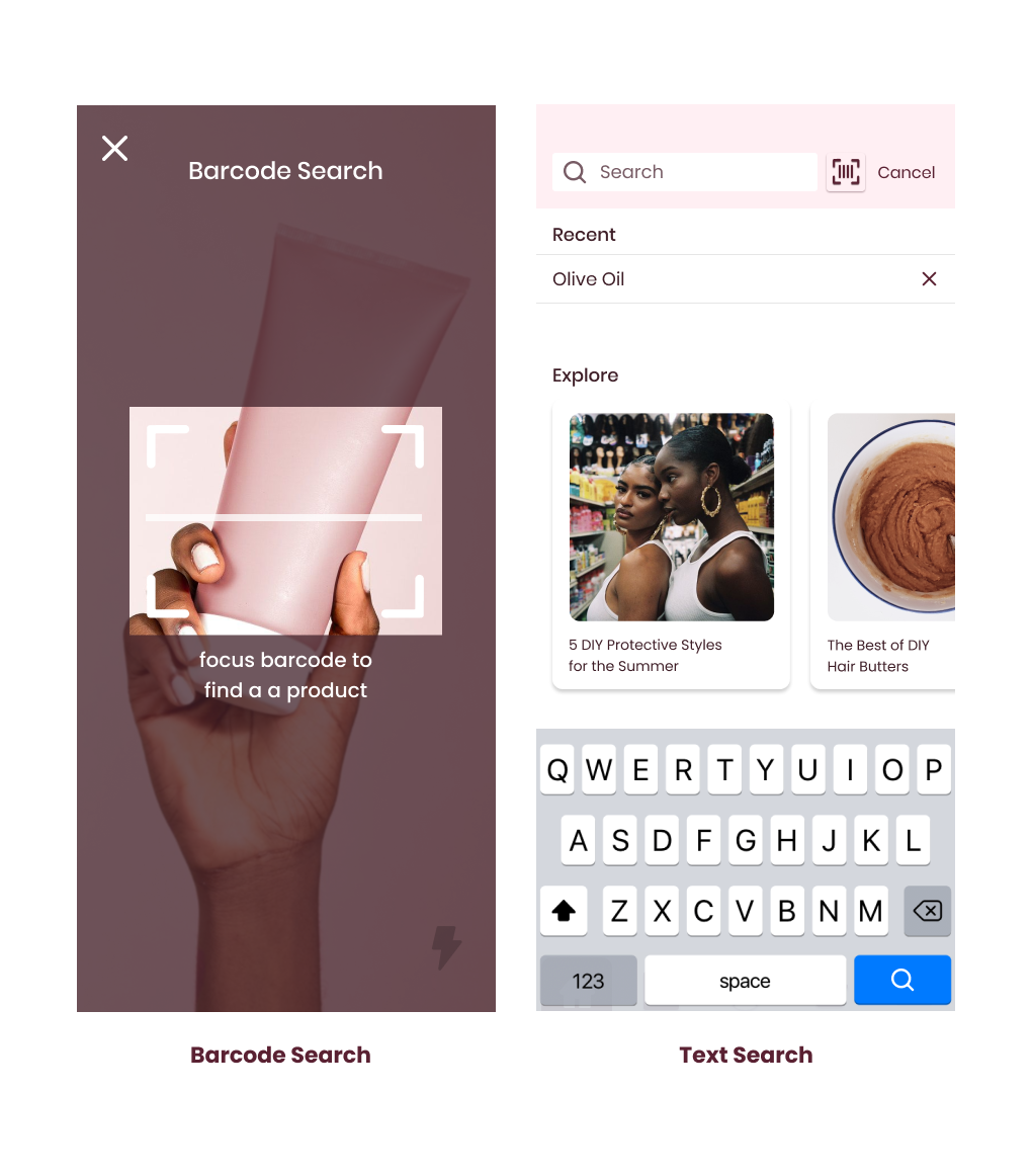
Product Discovery via Search or Scan
Primary entry point for in-store decisions
Barcode scan → safety rating → ingredient breakdown
Direct path to alternatives and purchase links
Converts uncertainty into a clear decision moment
Design intent: compress research into seconds at point of need.
Evaluation
DIY Formulation Layer
Bridges knowledge and action
Recipe library tied to ingredient database
Ingredients suggest DIY treatments
Supports experimentation with structure
Design intent: empower users to act on knowledge, not just consume it.
Product Discovery via Search or Scan
Primary entry point for in-store decisions
Barcode scan → safety rating → ingredient breakdown
Direct path to alternatives and purchase links
Converts uncertainty into a clear decision moment
Design intent: compress research into seconds at point of need.
Memory
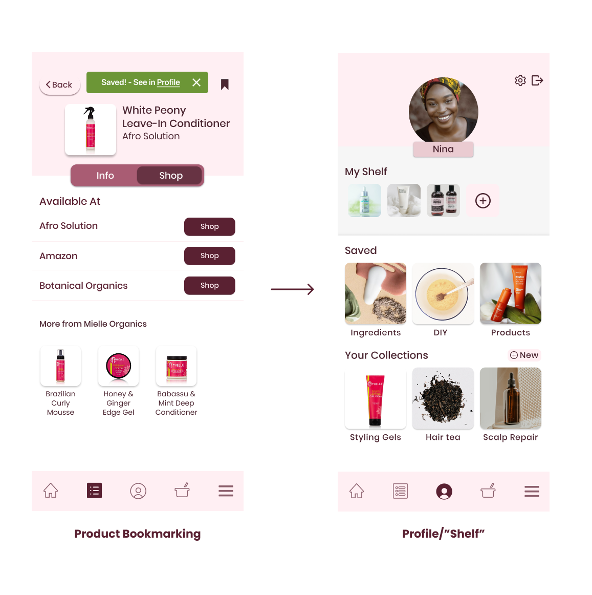
Knowledge Memory (Profile & Collections)
Where learning compounds
Saved ingredients, products, routines
Personal collections
Persistent knowledge ownership
Design intent: make progress visible and reusable.
Evaluation
DIY Formulation Layer
Bridges knowledge and action
Recipe library tied to ingredient database
Ingredients suggest DIY treatments
Supports experimentation with structure
Design intent: empower users to act on knowledge, not just consume it.
Product Discovery via Search or Scan
Primary entry point for in-store decisions
Barcode scan → safety rating → ingredient breakdown
Direct path to alternatives and purchase links
Converts uncertainty into a clear decision moment
Design intent: compress research into seconds at point of need.
Interaction Architecture Summary
Users can enter anywhere and stay oriented.
Examples of intentional cross-surface flow:
Scan → ingredient breakdown → related DIY
Ingredient → compatible products → save
Home → recommendation → evaluate → collect
Impact: flexibility without loss of mental model.
Usability Testing & Iterations
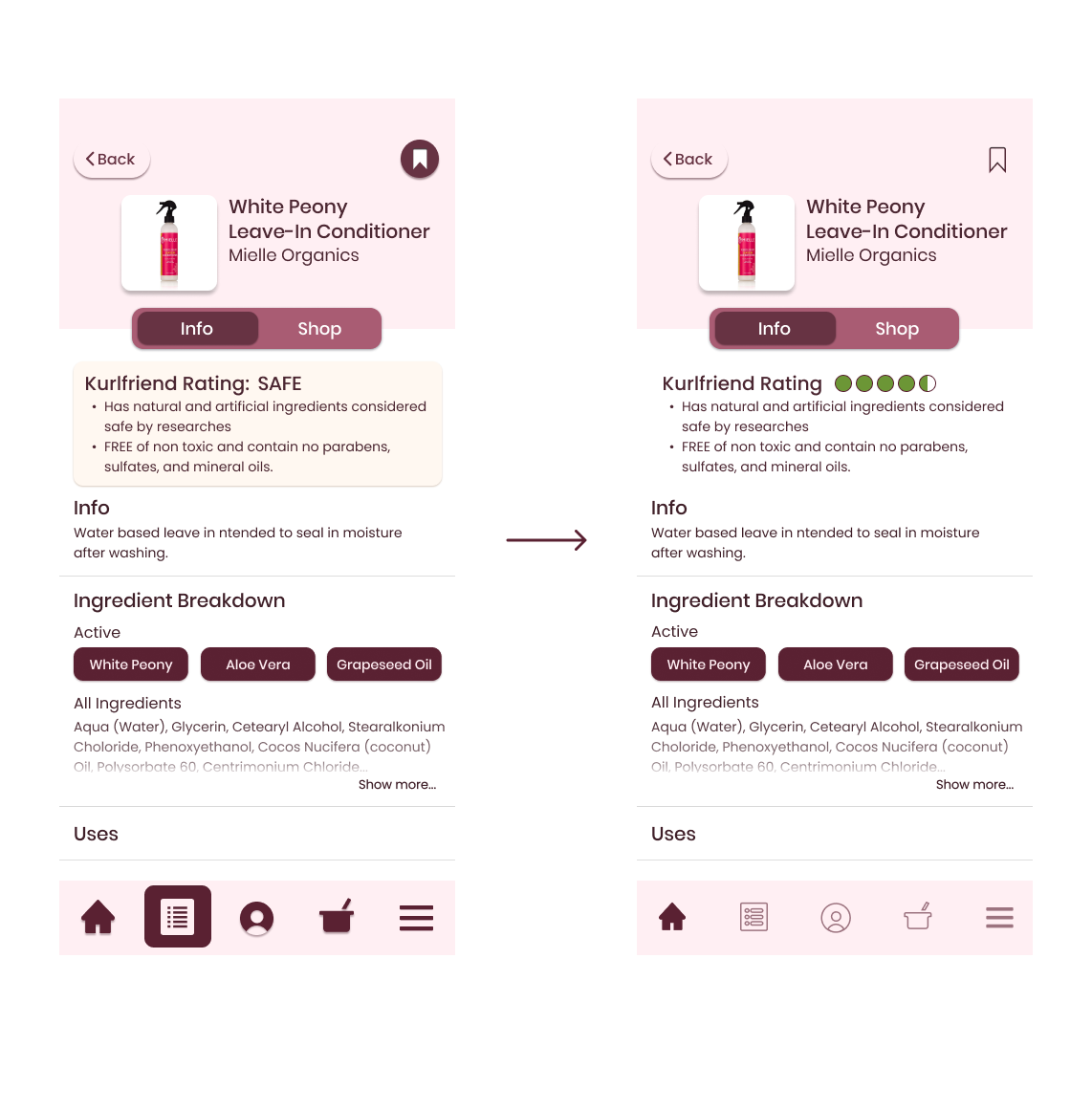
Product Evaluation Clarity
Early testing showed that qualitative signals alone required more reading and slowed decision-making. The updated design introduces a visualized quantitative Kurlfriend rating as an immediate indicator while retaining the descriptive safety explanation for context. Iconography was also simplified and the bookmark control was redesigned as a clear state-based save action, improving recognition and reducing hesitation during evaluation.
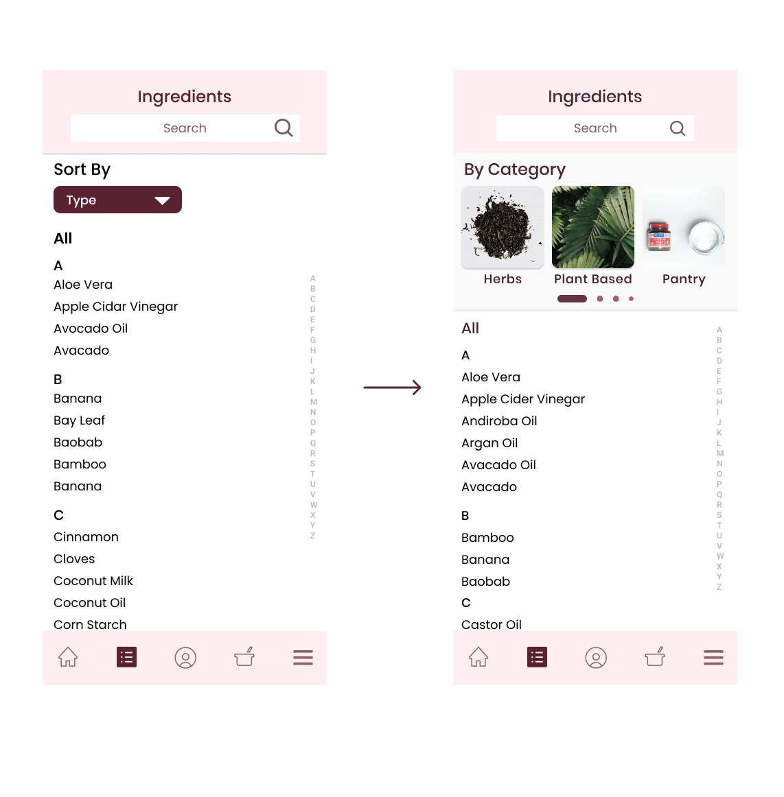
Guided Ingredient Exploration
The original ingredient directory presented a comprehensive but cognitively heavy list. The revised design introduces a category-based exploration layer at the top of the screen, allowing users to filter ingredients by type and navigate the database more intentionally, reframing the experience from browsing a list to exploring an organized space catered to your interests or available resources.